ZEIT: RESPONSIVE WEB DESIGN
A travel booking website that plans it for you.

PROJECT OVERVIEW
Challenge: Zeit is an experiential travelling company that seeks to reposition its brand as a company that is both modern and classical. Additionally, Zeit has requested a responsive e-commerce website for their vacation booking services, with intuitive searching filters and an easy-to-use interface.
Role: UX researcher, UX Designer, Interaction Designer, UI Designer
Tools: Adobe Illustrator, InVision, Avocode
Team: Self Directed, with guidance from mentor
PROCESS

EMPATHIZE
Process: Secondary Research, Primary Research, and Synthesis.
Review the entire research plan here.
As time travel is a service that does not yet exist, secondary research focuses primarily on exploring similar umbrella industries in which time travel tourism would likely fall under. Predictably, the experiential travel industry shared the most similarities with time travel tourism since both fields emphasize the significance of unique experiences, is priced at higher price points (relative to the average vacation package), and exist in a niche market.
Online research began with an exploration of current experiential travel companies, their target demographics, and their web designs.
I found three direct competitors in this subspace — National Geographic Expeditions, Lonely Planet, and Intrepid Travel — along with two indirect competitors that have significant influence in the industry, and identified strengths and weaknesses in their web designs according to current design principles and material design guidelines.
This information was paired together with an in-depth analysis of current travelling trends in North America, vacation travel statistics, and summarized in a competitive analysis to use in future design decisions.
Secondary Research
Assets: Research Plan, Competitive Analysis and Provisional Personas
COMPETITOR ANALYSIS
Here is a breakdown of the various direct and indirect competitors that I found, complete with their identified strengths and weaknesses, and four provisional personas that were made using that data.
Diving deeper into finding the needs of potential users, I sought out 5 individuals that fit the targeted demographic in my research plan to verify the authenticity of research assumptions and provisional personas.
During the interviews, I asked open ended questions to the participants to explore their various methods of searching, booking, mental states, and determining factors of when going through the process of planning a vacation. This gave me insight into the entire customer journey of my potential users.
Interviews were terminated once I began to see significant patterns in the participants’ answers, and I synthesized the information onto an empathy map to visualize the data, and delve deeper into exploring the various patterns that I might have overlooked in my initial analysis.
An empathy map was created using the interview data. Each of the post-it notes are statements taken from the interview transcripts, and each colour represents a different participant.
Primary Research
Assets: Interview Guide, Interview Transcript, Empathy Map, Persona
EMPATHY MAP
An empathy map was created using the interview data through previously recorded transcripts. I took down statements made by the interview participants and jotted them down onto post-it notes differentiated into 5 colours (1 for each participant).
After the initial mapping of the transcripts, I began to organize the data based on patterns and trends that I saw in the mass of information. I identified over half a dozen patterns, and picked the 4 most supported categories to analyze in further detail.
Each of these patterns have a robust amount of statements supporting them, include comments from most (if not all) of the participants, and contain statements that are closely aligned across multiple transcripts. These 4 patterns became the key insights that I took away from the exercise.
KEY INSIGHTS

These were the four main insights that I was able to extract from the results of the empathy map. Out of the four insights, “Users value unique experiences on a trip” was both 100% agreed upon by the participants, and the most supported pattern based on the data on the empathy map.
Using the results of my synthesis, I crafted a persona that would guide the rest of my design process as a representation of my targeted user.
PERSONA

DEFINE
Process: Storyboard • Business & User Goals • Product Roadmap • Sitemap
To properly define the problem that Zeit’s website is solving, I took the persona and story-boarded the issue, including how Zeit would come into the picture. This gave me more context and a visual of the problem, allowing me to better understand how external factors could affect the user’s story and flow.
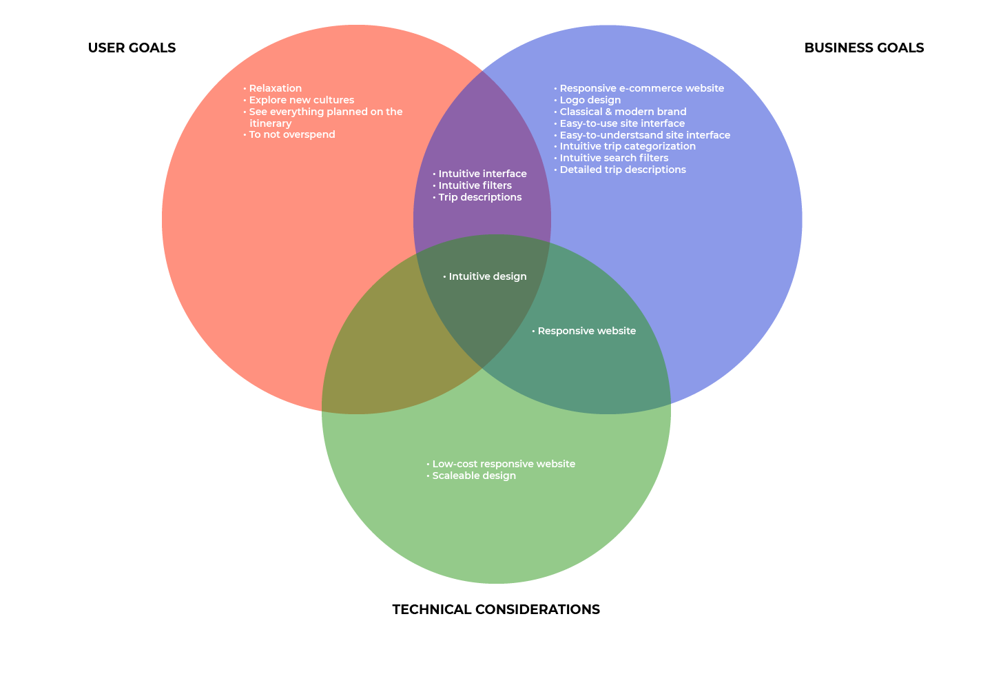
Then, I began defining concise user goals, business goals, and a list of technical considerations using the collected data and design brief.
Using a Venn diagram, I was able to visually examine the goals of all three groups, allowing me to compile a list of high to low priority goals based on overlapping needs between the three parties.
Having defined the various user and business goals, I went on to brainstorm a list of product features aimed at addressing these goals.
The features were then reorganized into a priority-based list in accordance with the following metrics: user goals, business goals, effort level (needed to create the feature), and confidence level (how much assurance I had in creating the feature).
In the final iteration of the feature list, it showcases a list of high-priority features necessary to create a minimal viable product (MVP), along with the middling and low priority features that it would take to create a fully fleshed out product. Since my purpose was to create an MVP, I set aside the middling and low priority lists to better focus on the high priority necessities.
Getting into the planning of my sitemap, I began the task with an open card sorting exercise with 10 participants of the targeted demographic. Each participant was given a list of Zeit’s vacation destinations (30 items) in no particular order and asked to sort them into self-created categories.
A glance at the results was all it took to see evident patterns in the data. In my subsequent (and more detailed) analysis of the results, I was able to ascertain three categorical “headers” that accounted for all of the vacation destinations - Historical Events, Time Periods, and Architecture.
Using the Product Feature Roadmap, headers, and a multiplicity of competitor websites as references, in conjunction with Material Design Guidelines, ensured that the result organization schematic would conform to user expectations.
Product Roadmap, Open Card Sorting, & Sitemap
Assets: Product Roadmap, Open Card Sorting, Sitemap
SITEMAP
This is the final iteration of the sitemap which formed the core of Zeit’s e-commerce web design, and a constantly referenced guideline for my user stories, task and user flows, and wireframes.
IDEATE
Process: UI Requirements • Task Flows • User Flows • Low-Fidelity Wireframes
• Mid-Fidelity Wireframes • Branding • High-Fidelity Wireframes
Three basic task flows were established in my UI Requirement Document which outlines how a user would potentially go about accomplishing each certain tasks in a diagram. From there I then created three user stories to further explore how a user might interact with the site given various scenarios and context, considering the key screens they would interact with, and what actions they might carry out on the various screens.
UI Requirements
Assets: UI Requirement Document
With the three critical user stories established in my UI requirements document, I mapped out different routes that could lead the user to finish a task from start to finish. This begins from the moment they land on Zeit’s homepage, and ends when they leave the website.
Task & User Flows
Assets: Task Flow Diagrams, User Stories
Using the basic outlines I created for Zeit’s website in my Product Feature Roadmap, Sitemap, and UI Requirement Document, I began to sketch a series of homepages themed around my Persona’s needs.
Low Fidelity Sketches
Assets: Low-fi Sketches

I re-evaluated my sketches, chose the one that best fit my defined criteria, and went onward to create mid-fidelity wireframes using design principles and Material Design Guidelines as the basis. I further created a set of complementary pages including the about page, categories page, trips page, and contact page to prepare for prototyping.
Mid-Fidelity Wireframes
Assets: All Mid-fi Wireframes

With the basic layout of the site rendered, I began formulating the redesign of Zeit’s branding. This began with logo creation, choosing a colour palette, and picking out a typeface. This was put together into a style tile to better inspect the entire look and feel of the brand in a single document.
Logo creation began with a mindmap of Zeit’s attributes. The exercise gave me a list of brand adjectives to work with, which kickstarted me into the sketching phase. I chose several sketches that resonated with me and began refinement.
In the end, I chose the hourglass concept because it highlighted my brand attributes the most, and was both simple and aesthetically pleasing.
Branding: Logo Creation
Assets: Logo Creation, Final Logo
Having chosen a suitable logo, it was time to get down to the colour palette and typography of the site.
As with the logo, I used the same brand adjectives to guide my process. This began with the creation of several mood boards in Pinterest, followed by research into colour and type psychology, and finally, inspiration through dribbble and Behance.
I settled with a vibrant orange as my highlight colour, and chose an a simple array of shades to compliment it. Keeping it simple and balanced in line with the classical and modern branding.
For the typography, I chose the sans-serif font “Avenir” for its well balanced typeface which keeps it sleek, futuristic, and easy to read.
Branding: Style Tile
PROTOTYPE
Process: Prototype • Usability Testing • Revisions • UI Design • High Fidelity Wireframes
The mid-fidelity wireframes were refined further, and used for a prototype that outlined my three user stories, allowing me to test the effectiveness and efficacy of the designs.
In preparation for usability testing, I created a usability testing plan that outlined 3 scenarios and various tasks that would allow me to test the effectiveness and efficiency of the designs.
Usability testing happened over the course of a week with online participants that fit the targeted user demographic. Again, I took the transcribed interviews, and synthesized the feedback, along with reactions (video and audio recorded through screenshare with the participants’ permission) onto an affinity map.
The affinity map gave me insight into common frustrations and pain points that the users experienced, and better informed my revisions as I began designing solutions to these problems.
Prototype & Usability Testing
Assets: Usability Testing Plan, Usability Test Notes, Affinity Map
AFFINITY MAP INSIGHTS & RECOMMENDATIONS
Affinity mapping allowed me to pinpoint two areas of concern: 1) Confusion with the organizational structure of the filter and 2) Confusion with regards to some of the headers on the site.
To solve these issues, I labelled the cards in filters that were harder to quantify (eg. popularity), and re-titled several section headers into more generic titles (this was done with many references to competitor sites).
A second round of revisions adjusted the padding, gridding, and hero images to be much more balanced, engaging, and aesthetically pleasing.
Revisions
Refinements into the UI of the design finally brought my UI Kit, which was a living document that constantly changed with every iteration of the site, closure. The finalized colours, typography, and style were rearranged into their atomic and molecular forms, and put together in a cohesive document.
UI Kit
Assets: UI Kit

The next step would be to formally hand off the assets to the client or developer. This would be followed by continued testings of the design updates since the last usability testing, update the UI Kit, and continuously cycle through iterations and testing for as long as resources allow.
Iteration
As a frequent flyer and a seasoned professional in industries that do not easily allow for large vacation periods, I found, through my research, that many people shared the same problems that I have struggled with — looking for authentic and quality experiences with only several days to spare for vacation per trip.
And after working on this project, I have come to the realization that many travel booking websites, partly due to the huge amount of content that they have to offer, have extremely cluttered designs that make the searching and booking process that much more tedious and time consuming.
My solution, after the research phase, was to essentially declutter that mess by using a simple and more direct organizational schematic to lay out similar information.
Although currently, there seems to be the same problem — a chaotic organization scheme — across many travel websites, I do believe that there needs to be some serious redesigns in this space.