NanoGiants Hackathon (2021)- Feedster

PROJECT OVERVIEW
Challenge:
The goal is to find solutions that make the findings from feedback aesthetically visible, easy to understand, and the dashboard enjoyable to use. Design this within 54 hours.
Objectives:
Design a dashboard for UX Designers that is user-friendly and delightful to use
Create features that enable the user to further processing and share insights with colleagues
Role:
UX researcher, UX Designer, Interaction Designer, UI Designer
Tools:
Figma, Miro,
Team:
Joseph Chan, Octavia Romano, Jenna Swan, Jana Brokate, Grace Adewale
VIDEO PITCH
THE TEAM & TIMELINE
Process: Team Member Match Up • Timeline

Meeting and working with four other UX Designers online, and then proceeding to conceptualize and ship a deliverable within 54 hours was a daunting process. Everyone knew that time was ticking, and we had to effectively plan out our next steps in a methodical manner.
After a brief introduction from each of our teammates (we had members from Canada, USA, South America, Germany, and UK), we established two working teams based on the time zone differences of our respective locations.
Research would begin with the North American team, the others would begin picking out UI Kits and design tools, and we would reconvene to decide a course of action the next morning (based on Germany time as that was where the Hackathon was held).
EMPATHIZE & DEFINE
Process: Secondary Research • Insights & Problem Statements
I began research with a in-depth dive into Data Analytics, the overarching industry in which business intelligence tools belong to.
Studies found that data analytics presented an overwhelming amount of information that was hard for users to digest and interpret.
Dashboards were a Data Visualization method aimed to reduce the strain of this information overload, but often oversimplified large amounts of data by forcefully compressing this information into charts and graphs.
As a result, many dashboards support a variety of features and functions aimed to further process this information, but in doing so, created a steep learning curve for new users to utilize.
After a discussion with the team, we decided to focus on two specific problems due to the results of the research:
How might we present UX Designers with all the information they need, one chunk at a time?
How might we design a navigation system that is simple and easy to use?
Secondary Research
Assets: Research Plan, Market Research, Competitive Analysis, Insights & Problem Statements
With the problem space clearly defined, I led a group feature brainstorm session on Zoom to come up with feature solutions to the identified problems.
Group Feature Brainstorm
Assets: Empathy Map
The group was given 5 minutes to brainstorm each question, and after ideating, I went around the group in a round-robin format and had each individual pitch their ideas.

Predictably, many ideas coincided, but we were able to notate the ideas that kept popping up. Refining them further through discussion.
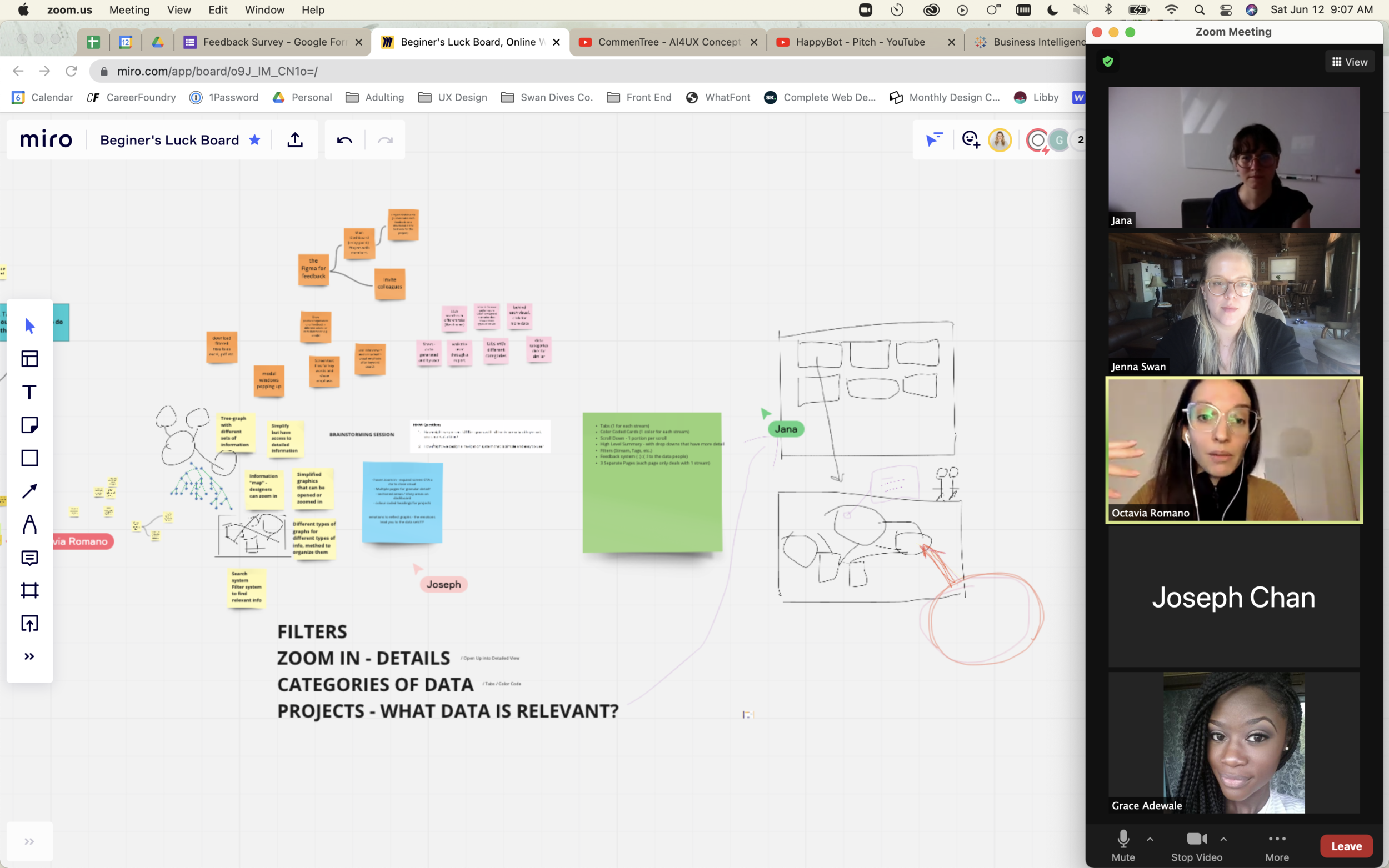
Finally we agreed on a single feature as our unique solution to each HMW question, and improved the original idea through a series of discussions that led each of us to gain new perspectives on how the feature can tackle the problem space.
This feature eventually became Feedster’s value proposition.
INTERACTION DESIGN
Process: UI Requirements & Feature Roadmap • User Flows • Mid-Fidelity Wireframes • Hi-Fidelity Wireframes
Several team members were sent to begin Lo-Fi wireframes using the basic features that we agreed upon in brainstorming, I began creating a high level UI Requirements and Feature Roadmap to further guide our design processes.
UI Requirements
& Feature Roadmap
Assets: UI & Feature Requirements

I coordinated with two other members of the team to narrow the features down to the absolute minimum that we would need for an MVP using a quick user flow as the basis.
Using the Mid-Fi Wireframes that my teammates created, I continued the work by translating several frames into High Fidelity using the guidelines that we previously established.
High Fidelity Wireframes
Assets: Low-fi Sketches (Mobile)

I took note of the various elements on the page, and recreated a layout that conformed closely to the other High Fidelity pages that were built, which still retained all of these features and information points.

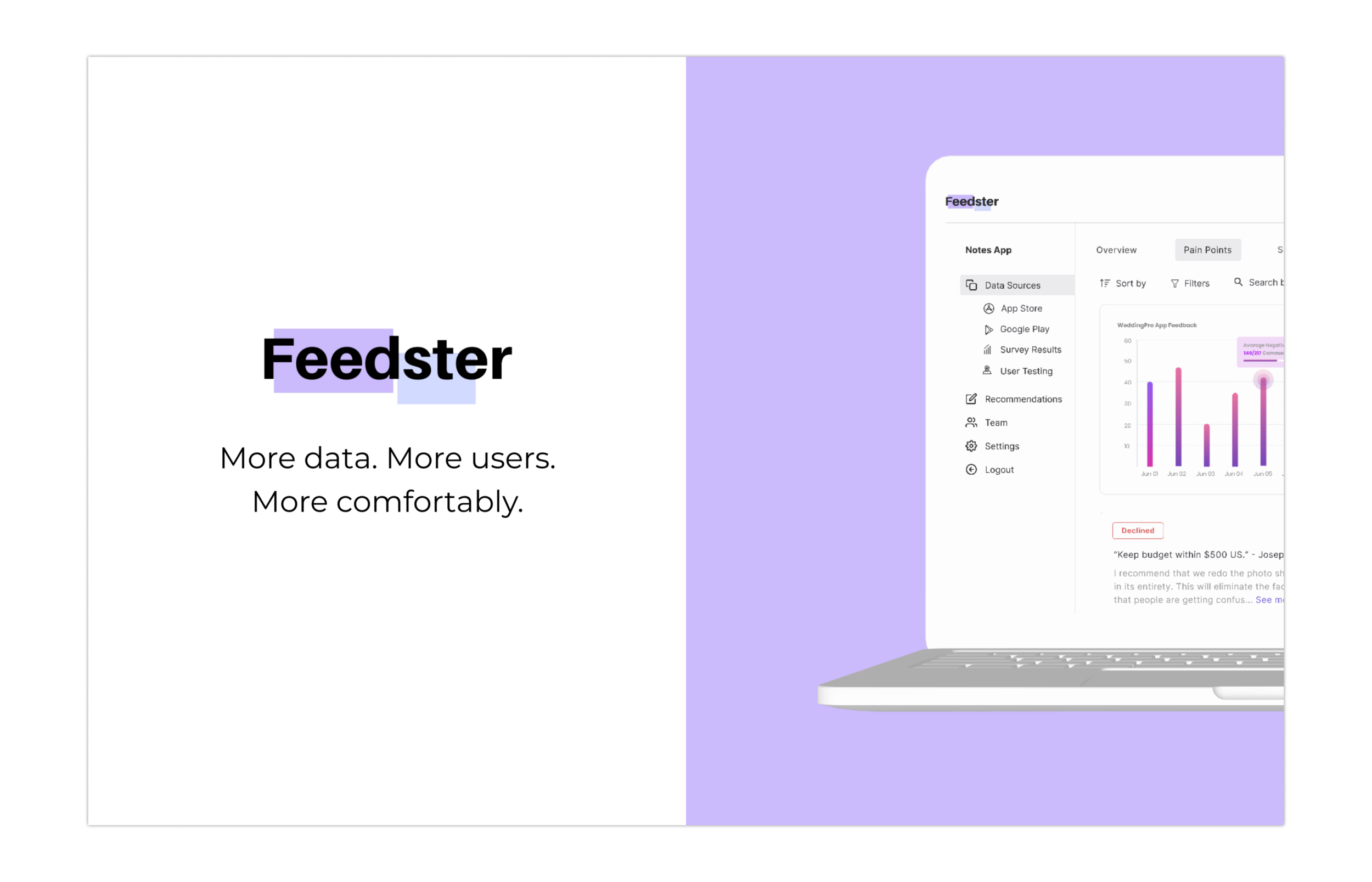
PROTOTYPING
Process: High Fidelity Prototype
The high-fidelity wireframes were combined and adjusted to ensure that the UI was consistently applied across the different boards. These wireframes were then used to create a prototype that outlined a simple user flow.
Prototype & Video Preview
Assets: Prototype